


An A1 typographic design poster based around the war in iraq. 80+ layers and major use of the Multiply and Threshold tools.

A horror themed live brief piece made for Tam Fest. 4 layers each with a linear burn and varying levels of opacity
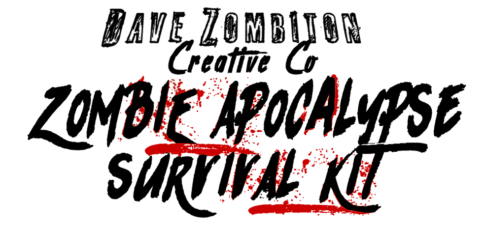
The logo i designed for my graded unit, a Survival Kit based around Surviving A Zombie Appocaylpse

The first side of my intro card for my zombie survival kit with a description of the the contents

The reverse side of my intro card, giving instructions on how to use the products

The first side of my pocked survival guide mostly gives really bad advice on how to survive against differant types of zombies

The second side gives some funny information on how to arm, feed and keep yourself safe, all info is stupidly false

The front of the label on my zombie bait bottles. The style created here is repliacted with the other products.

The reverse of the zombie bait bottle has a humerous message on how the bottle will not work if you use it.
